Dining & Breakfast Area Transformation
Before & After
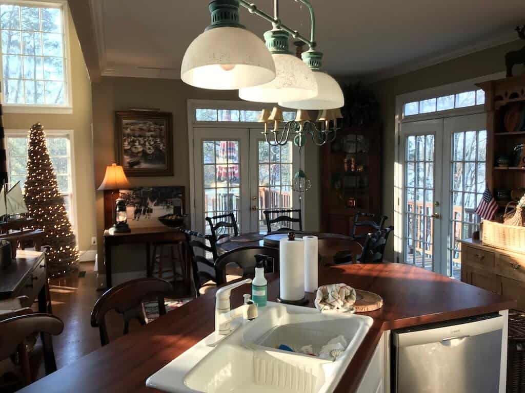
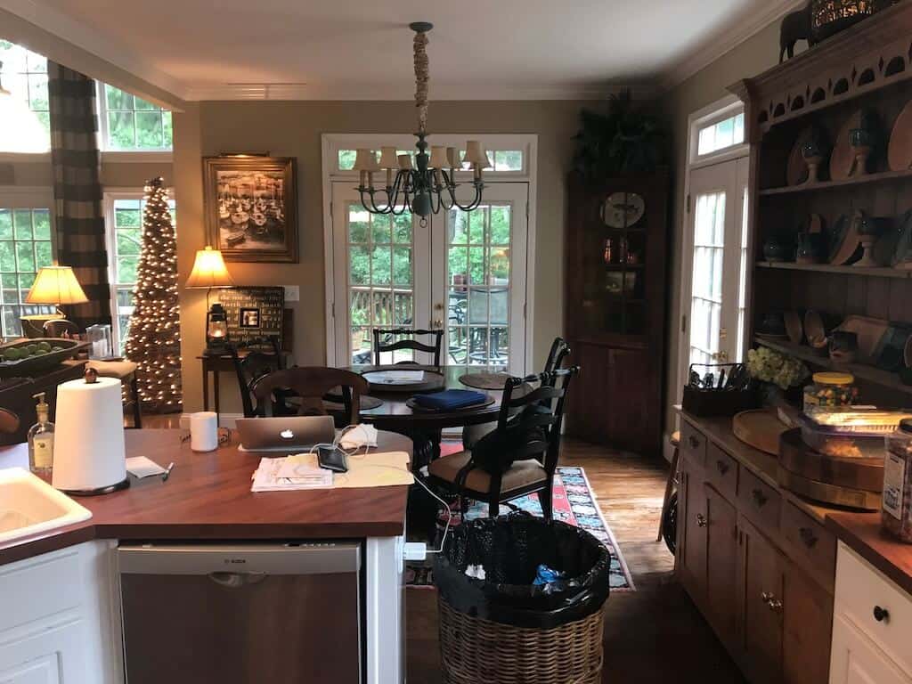
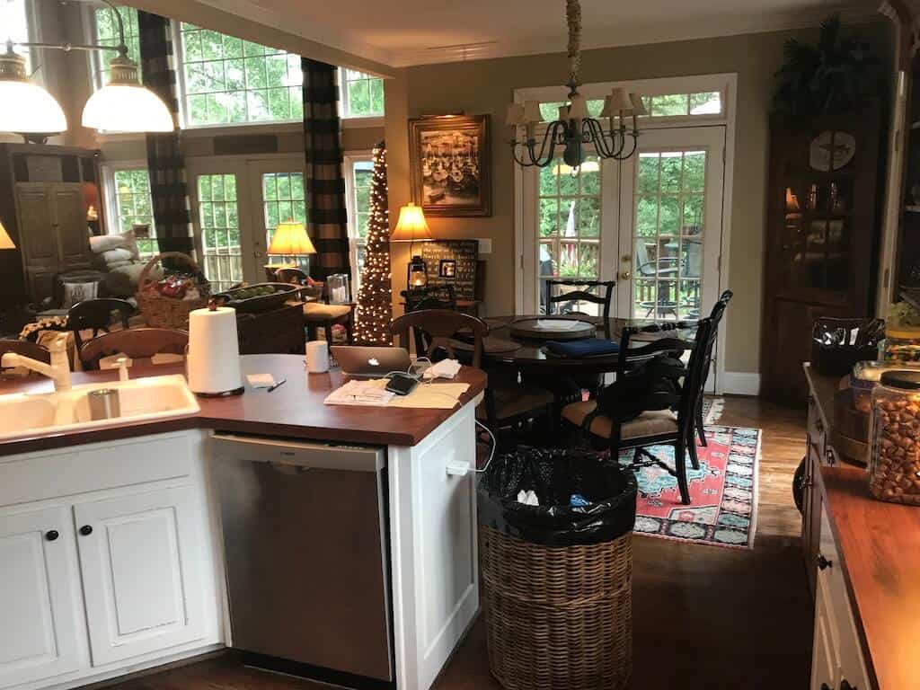
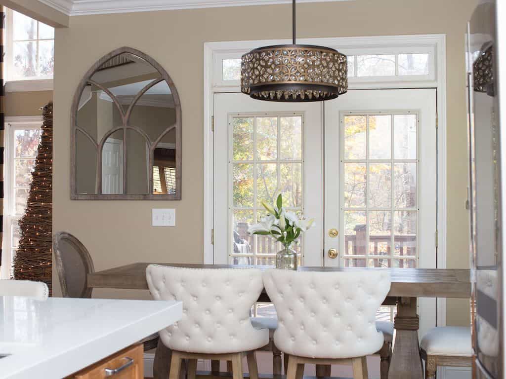
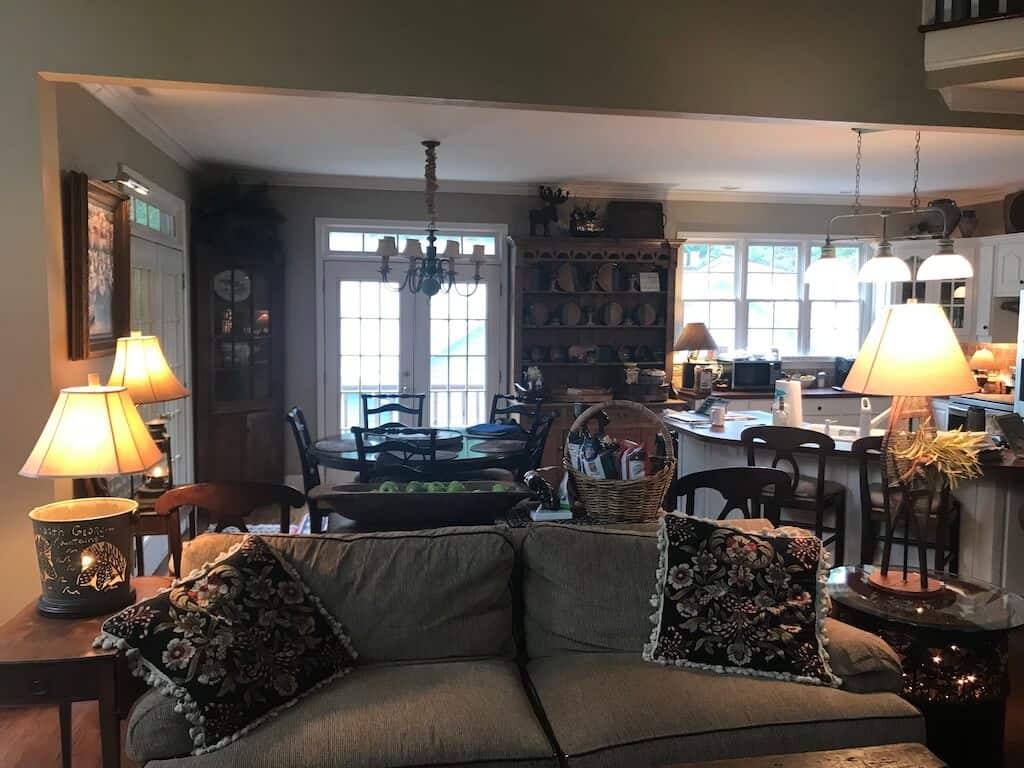
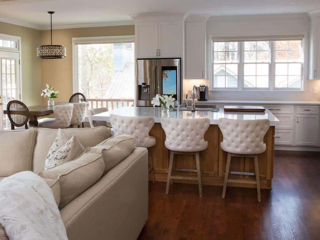
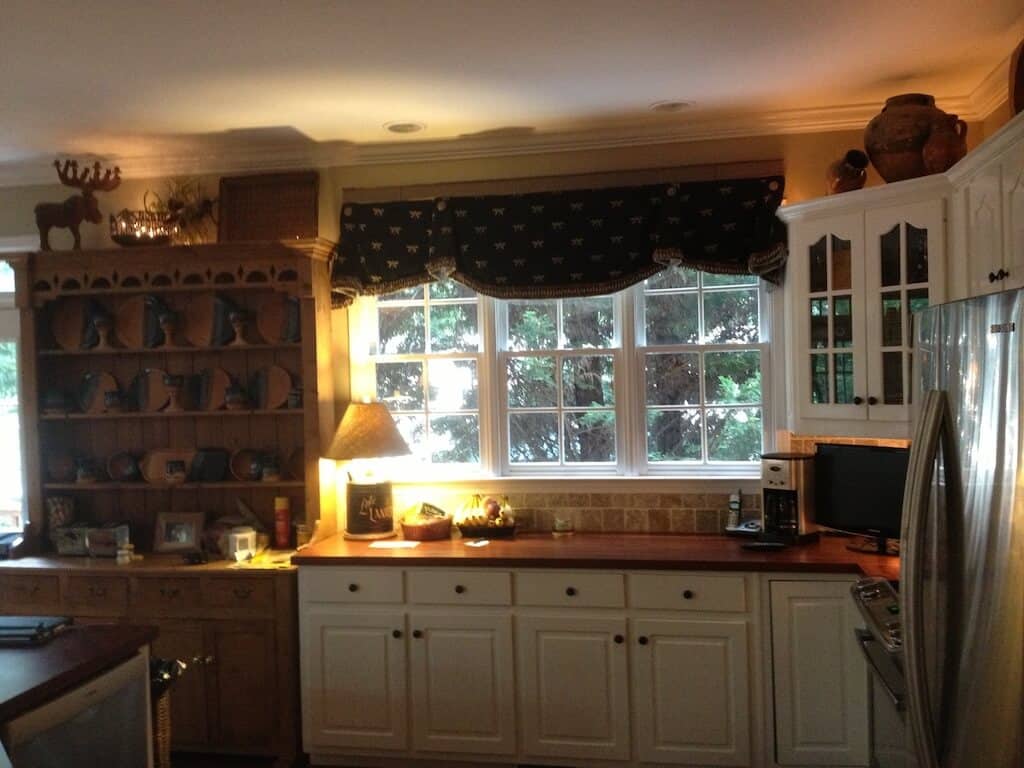
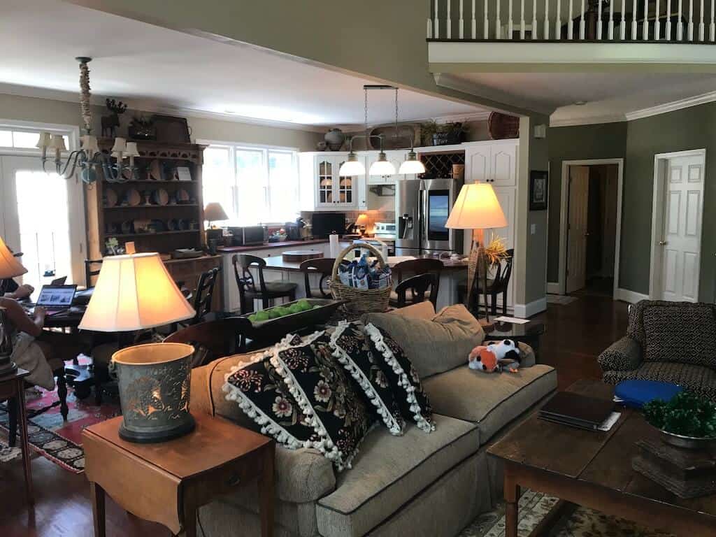
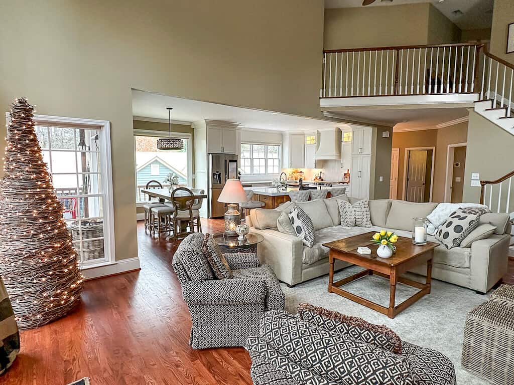
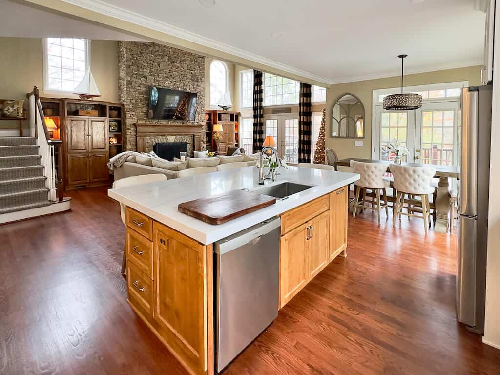
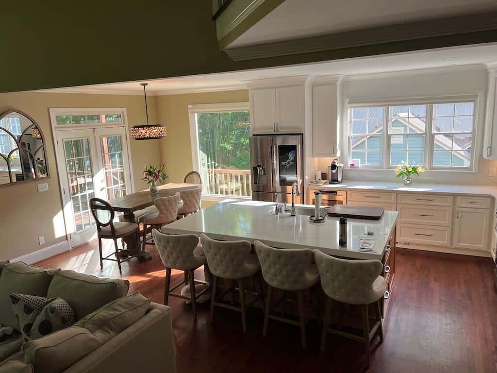
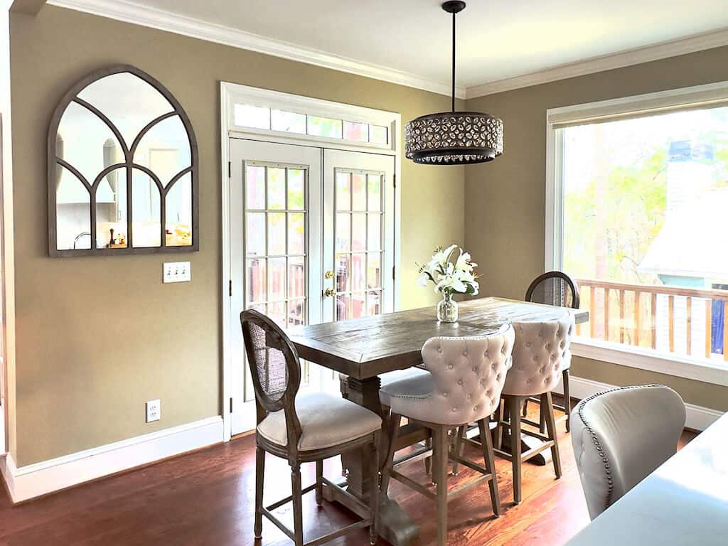
Dining & Breakfast area was brighter than photos appear. There is nothing like some poor images of our dining space before the remodel to make the after appear SPECTACULAR! Ha.
A round table for dining is my absolute favorite. No one is out of the conversation, and you can see all the bright and shiny faces.
For the newly created dining space, a round table did not work. My struggle with choosing a dining table was an afterthought.
When I say afterthought, I had a custom table made for the space before the space was complete. Wrong! I wish I would follow my own advice in my Decorating 101 ~ Story, patience.
The good news about the dining area blunder is it was purely cosmetic. No structural changes were necessary for this area. Except for the picture window, but that was in the plan all along.
The Dining Table Dilemma was so traumatic I had to devote an entire Post to this error in judgement.
Design Decisions
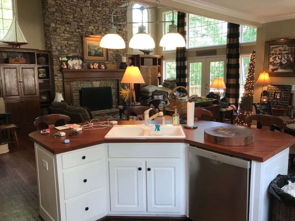
First, about the old chandelier over the island, it was great, but toward the end of its life, it drove me crazy. Because of this, I decided to remove any hanging light in the kitchen area. Additional reasoning about my decisions include post here about what you are not supposed to do, which I ignored.
When the time was right, the French doors on the side wall next to the Hutch were in the plan for replacement with a picture window.
Removal of all the extras (side table, lamp, corner cabinet, Hutch) was a priority when the remodel began.
The Perfect Dining Table. In my head, I knew what it was, and I tried to create it. While the error haunts me, the experience of the failure is brilliant.
I will never order custom-anything again. I should never say never, but two of the costliest mistakes I made were from a custom order. Actually, I will never purchase a big-ticket, non-returnable item again prior to space completion.
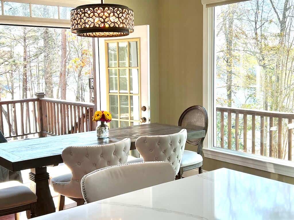
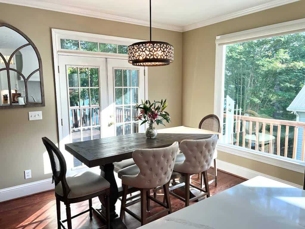
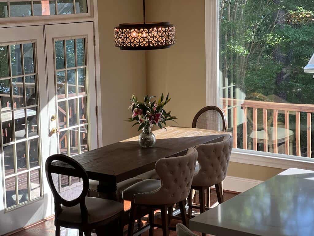
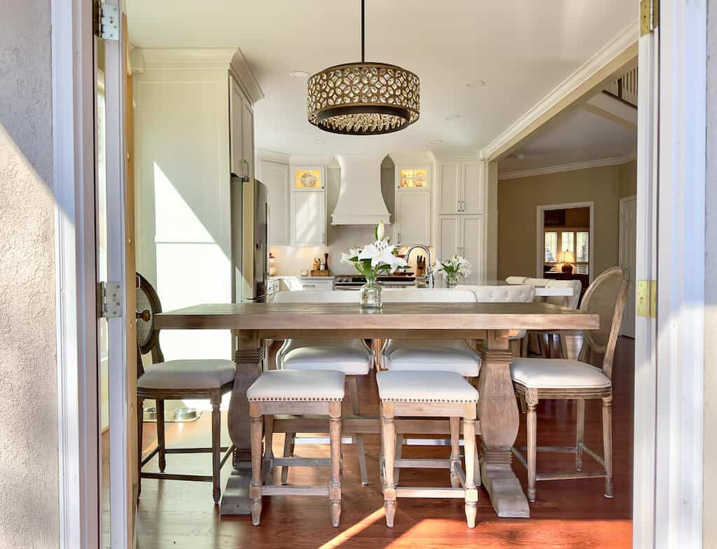
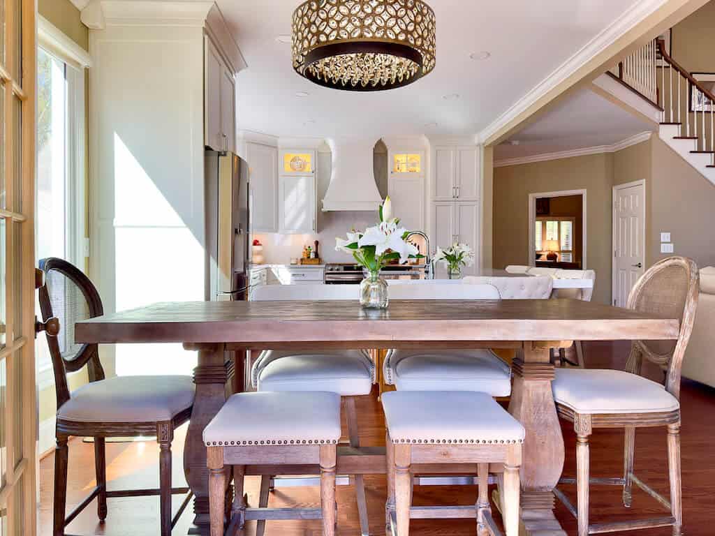
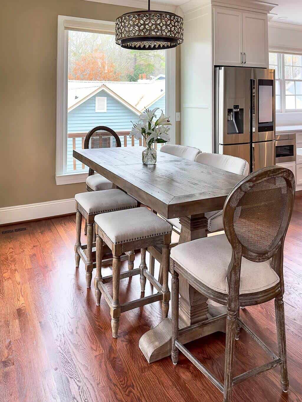
Narrow, long, counter height table for this dining space is the only option.
77"L x 30"W x 36"H
Who knew? I cannot stress enough, if you have the option to try things on approval, do it.
The Lighting
I always knew I could brighten this space up, ya think?
I said to myself over the years, it is a lake house and do need the dark wood for the Rustic-ness.
That's what she said.
Is there a way to say I over-furnitured? Corner cabinet, the Hutch, the 60" round dining table, the accent table by the door, the sofa table, the extra counter stools, argh.
This image really looks horrendous because it was right after our move to the lake, and I had to put stuff everywhere.
Okay, you caught me. Only new thing added in the picture above was the Sugarboo frame sitting on the accent table. Most everything else had been there. I was busy!
Can we begin with the chandelier replacement? This statement is worth repeating because I refer to these old light fixtures a lot in this blog. I was over them.
The 1998 light fixtures had to go. For many years, I tried time and again to replace them or paint them but never followed through, and it is okay.
I never knew where the future table would go, so it wasn't necessary. Always hang your chandelier over the center of the table, no matter how it lines up with the rest of the room.
Hey, at least I waited to hang the chandelier after I found the perfect table. I saved a lot of drywall headache for my husband. Most certainly doubt he is going to see it that way.
Maximizing A Small Dining Space
I loved my kitchen from the get go. The first day building the home in 1998, the design was perfection. For entertaining purposes, the creation of my dream kitchen was a design that incorporated the dining room and great room. I am impressed with my 1998 self when it came to this feature.
Check out my 1998 Inspiration Book for all the images that helped make this decision.
The original home plan design is still relevant. It leans to the rustic feel, incorporating the lake from every angle. Not having to change the footprint of our perfectly sized lake house has been a miracle.
A kitchen remodel begins with the cabinetry. There are many options to consider throughout the process.
One of our options included keeping the current cabinets and adding a fresh coat of paint. Significantly more cost effective. My husband tried to present this as an option. NO! Instead of sharing the pains-taking reasons, NO!
Because the decisions about your cabinets are paramount, I created an entire Post about choosing your Cabinet Contractor.
The Lack Of Vision
The view of the lake became the starting point for all of the room remodels, especially the kitchen.
As you can see from the images above, unfortunately we had to cut down the Lelands that had provided a barrier to hide the house next door.
We planted new Green-Giant-Evergreen trees in 2020, and they have begun to grow, just not there yet. Spacing the trees to maximize the lake view while providing privacy, hopefully soon.
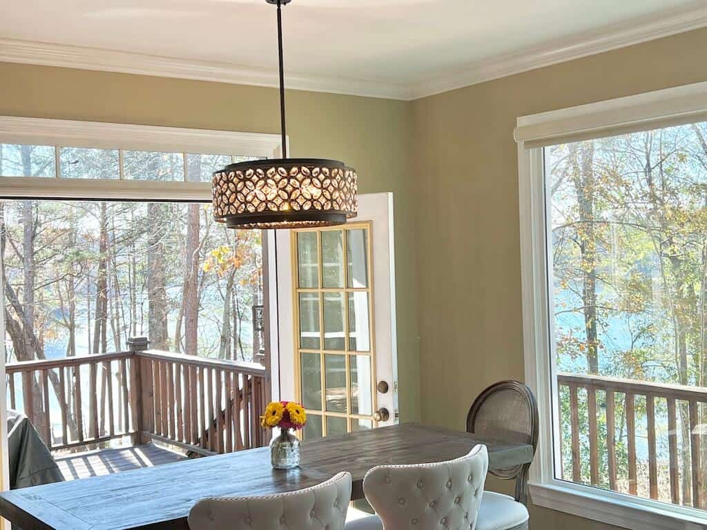
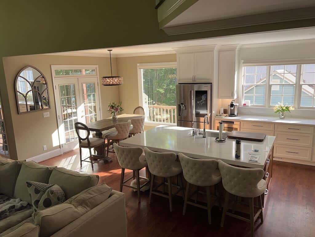
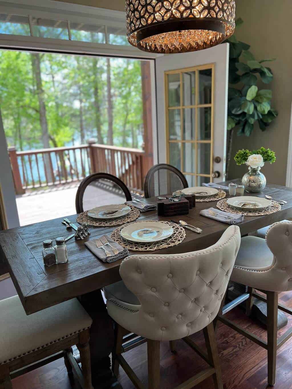
The Picture Window has created massive brightness and provides a gorgeous lake view.
Kitchen countertops and cabinets also lend to enhancing the brightness. The island base is stained, and the contrast keeps the kitchen balanced. Adding wood elements help tie all of the rooms together.
Our vision has always been to keep the lake front and center. The lake is the focal point of the entire home. Enlarging the views provides a daily shimmer when the sun is shining.
Knowing what you want and making it happen in the space can be challenging. Enter many Contractors, many ideas and many, many dollars.
The ability to create the Dream Kitchen does not happen over night. Decisions need to be tactical, so the more research done ahead of time is critical.
Again, each square inch needs to be considered and planned.
For our kitchen remodel, it was all taken into consideration. Yay, me!
I did need to upgrade some of the furniture. How can that possibly be with two fully furnished homes?
Let me be clear about the cosmetic upgrades with a remodel; you will want new stuff.
Yes, it's a thing. Prepare and budget.
The Footprint
Being desperate for a TV over 20", hanging the 75" TV on the fireplace helped with some of the design intention.
Not having pendant lights above the island provides a clear TV view and saved some money. See full post here about this decision.
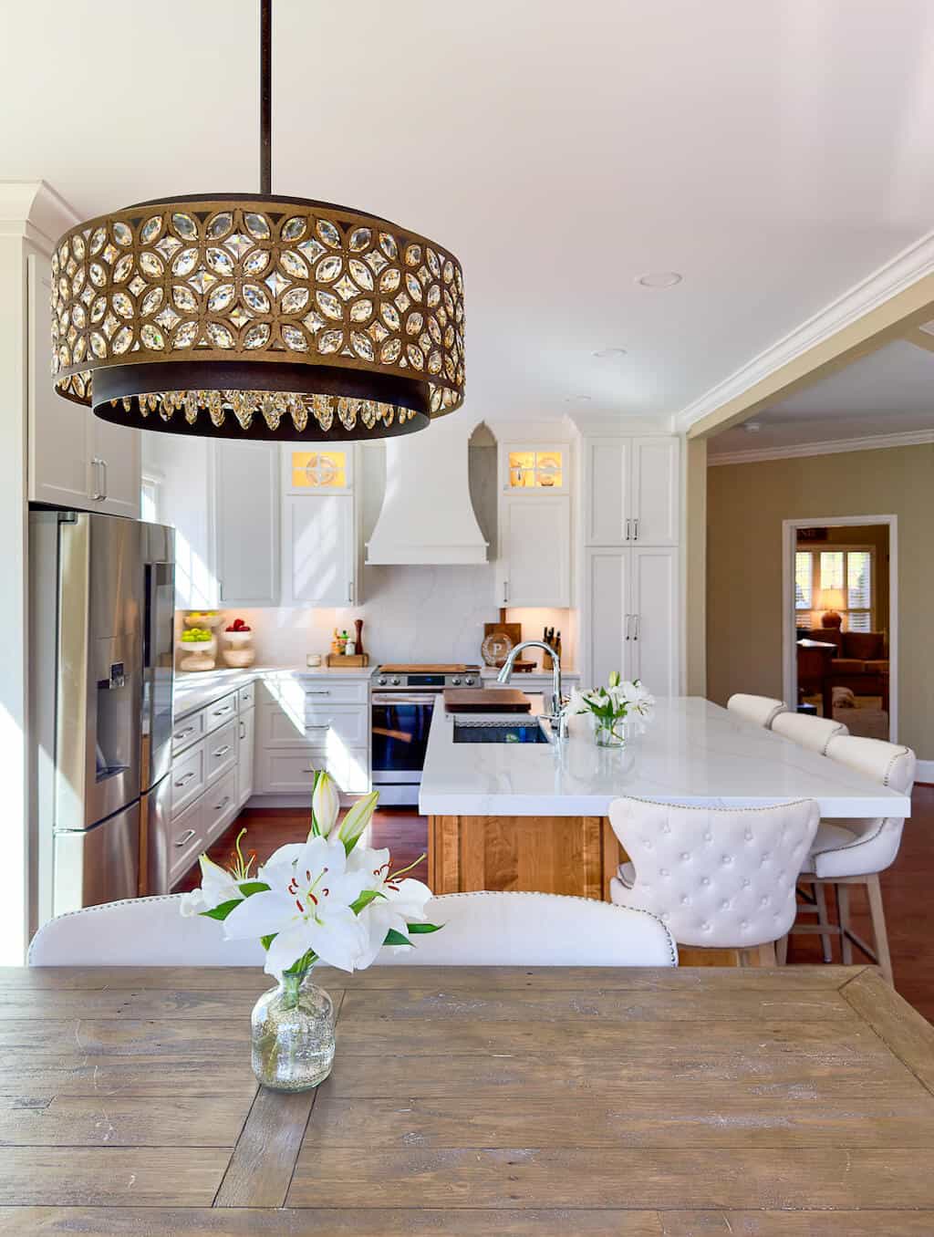
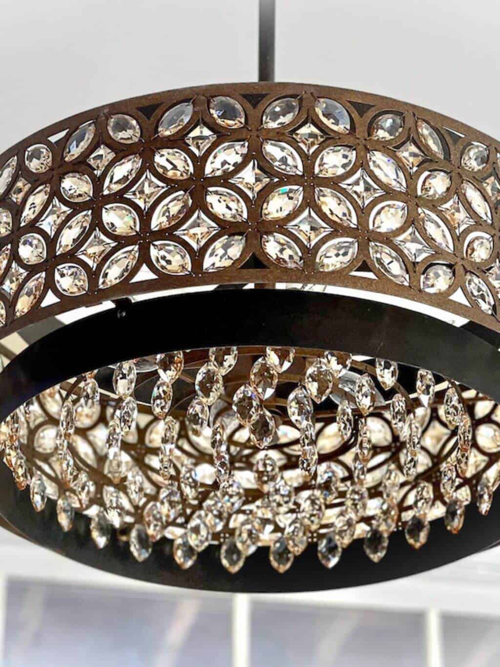
Dining room chandelier would provide the dimension needed for the space. The chandelier offers brilliant light and sparkles while incorporating a rustic feel.
The footprint of the home is excellent. An open floor plan allows for everyone to be together at all times.
Complete rework of the kitchen has been life changing. Backing into the kitchen design worked beautifully. Using the non-negotiables as the starting point and infusing the ideas I have had for years really paid off. Choosing the flush overhead lighting helped create a minimalist aesthetic and cleaned up the kitchen space.
With the assistance of a great cabinet craftsman & his team, my dream has became a reality.

