Kitchen Transformation
Before & After
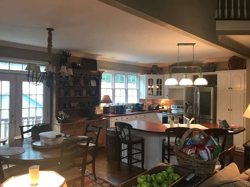
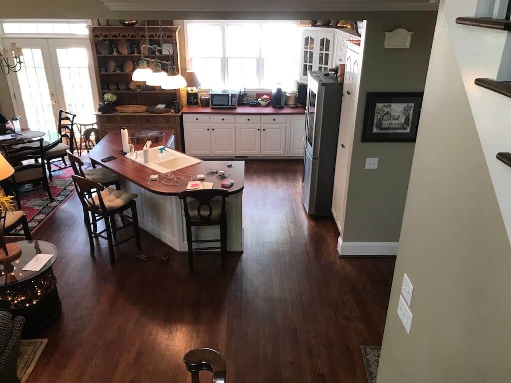
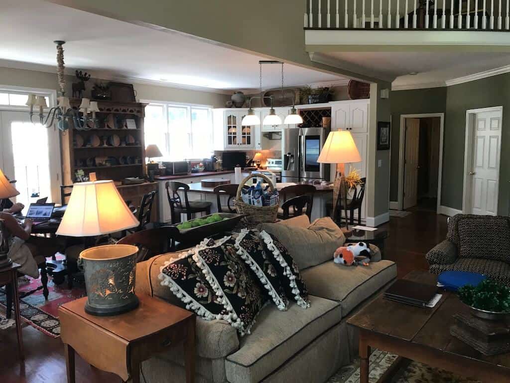
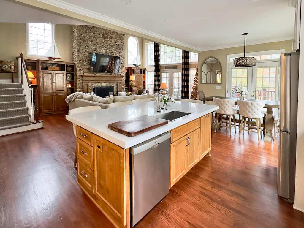
The Before Kitchen Above. Let's introduce some brightness, shall we?
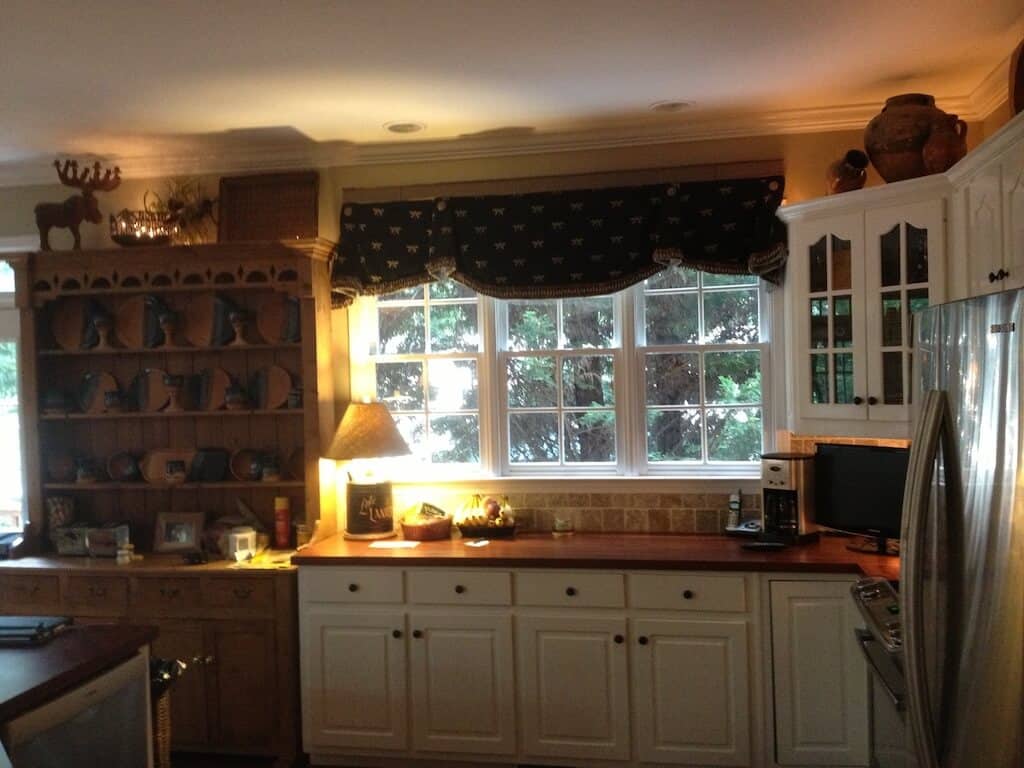
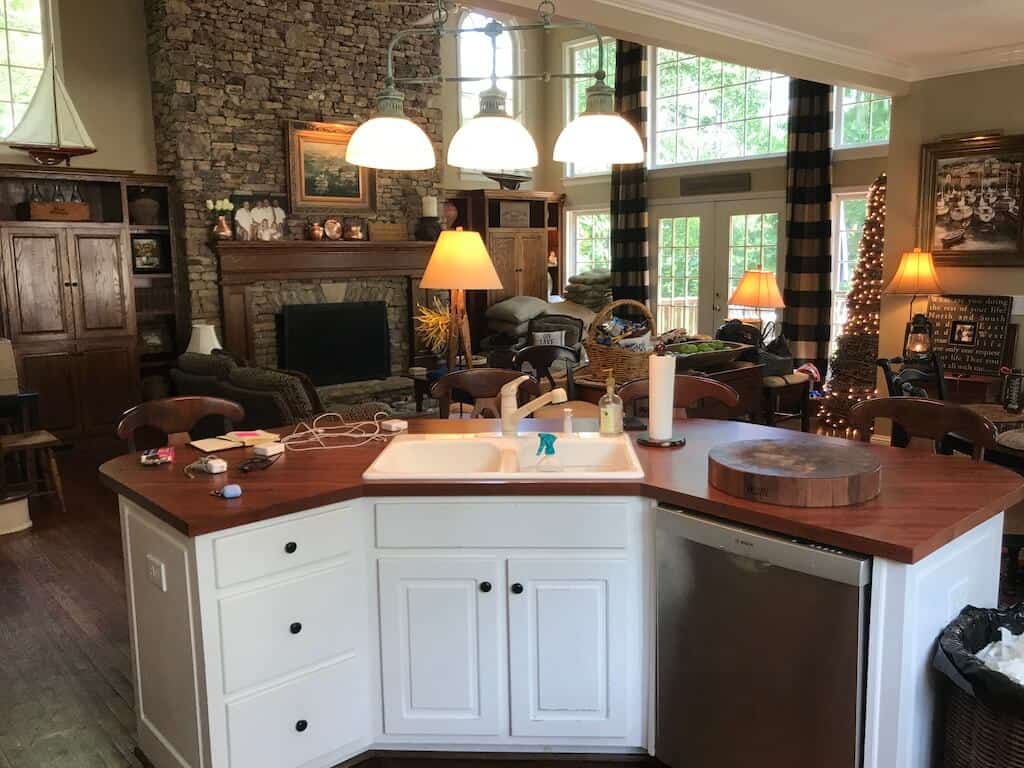
The Windsor Mahogany Formica countertops were a cost-effective option in 1998. But boy, was I ready for an upgrade. My nickname is the counter nazi because of my compulsive OCD and nonstop cleaning, and the hard surfaces are my favorite to spray and wipe. Yay.
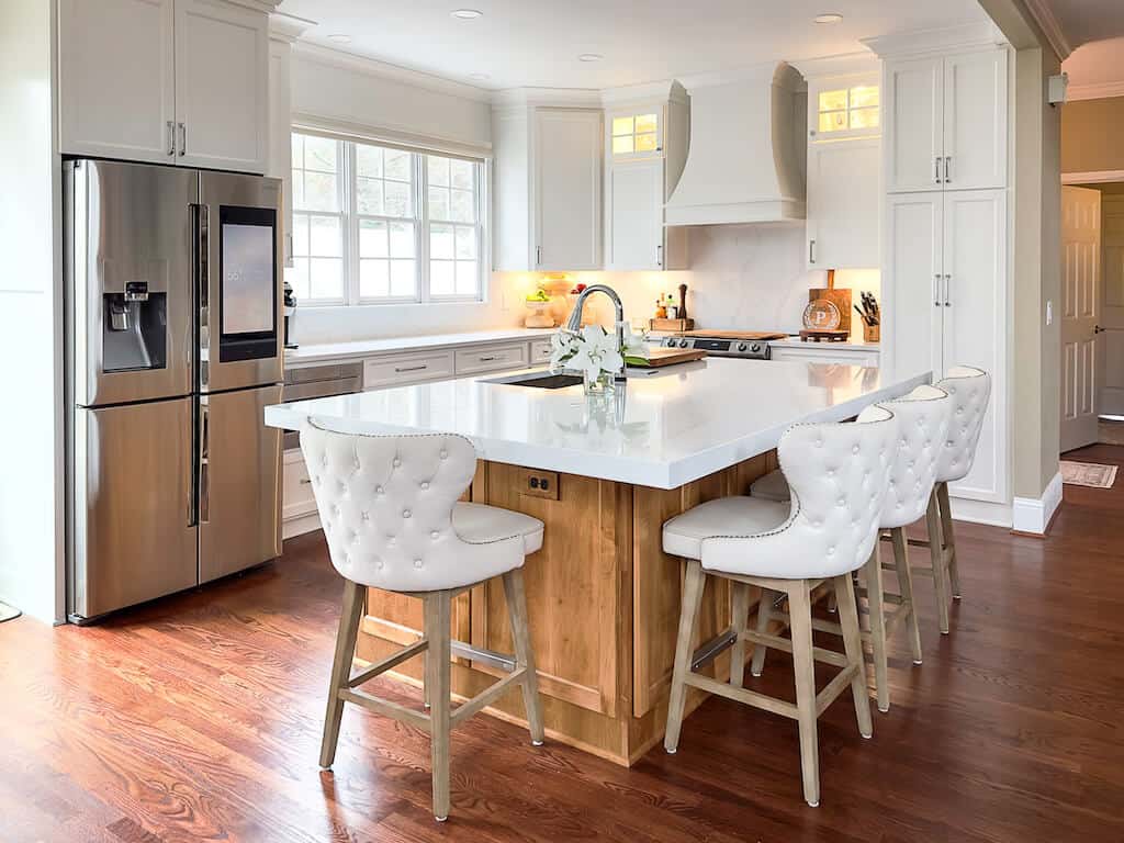
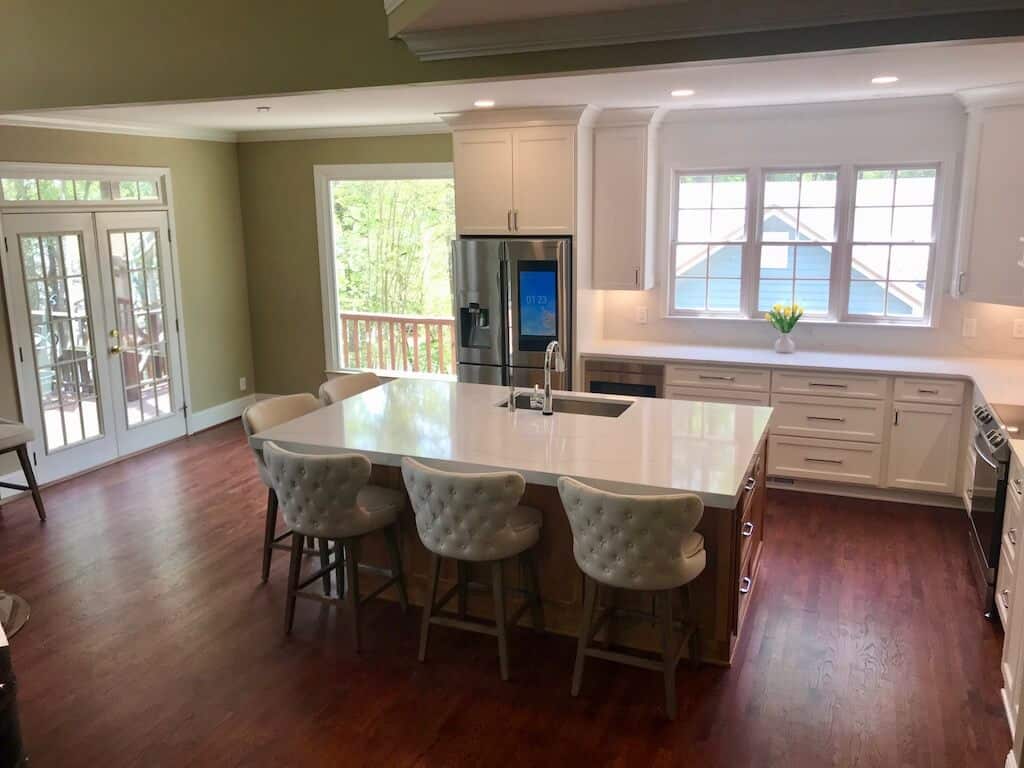
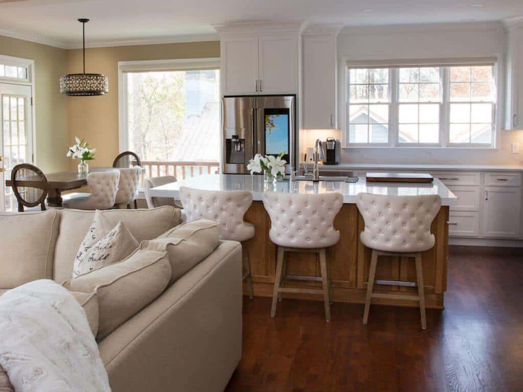
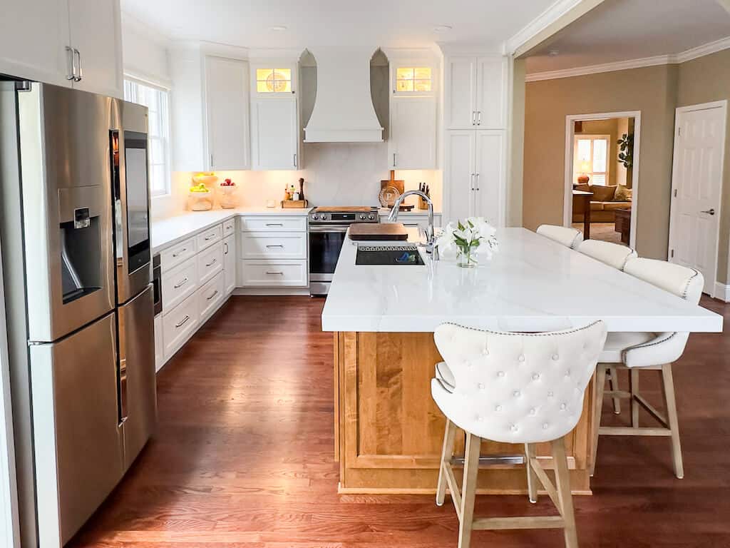
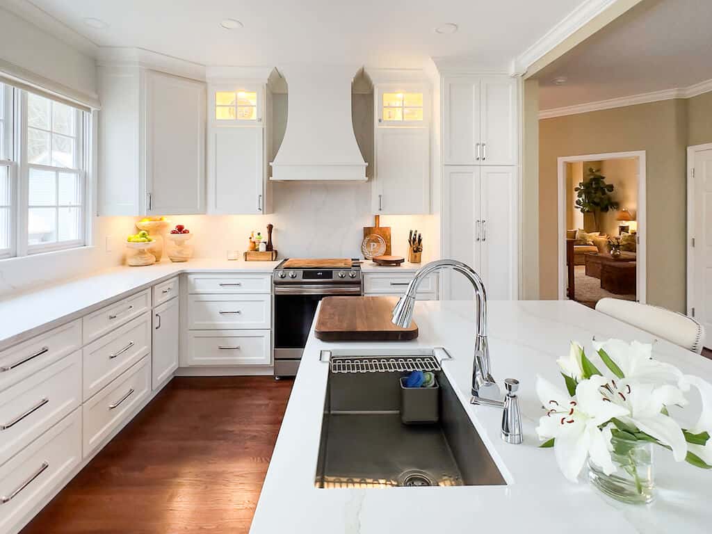
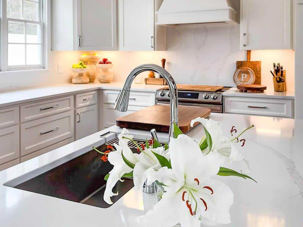
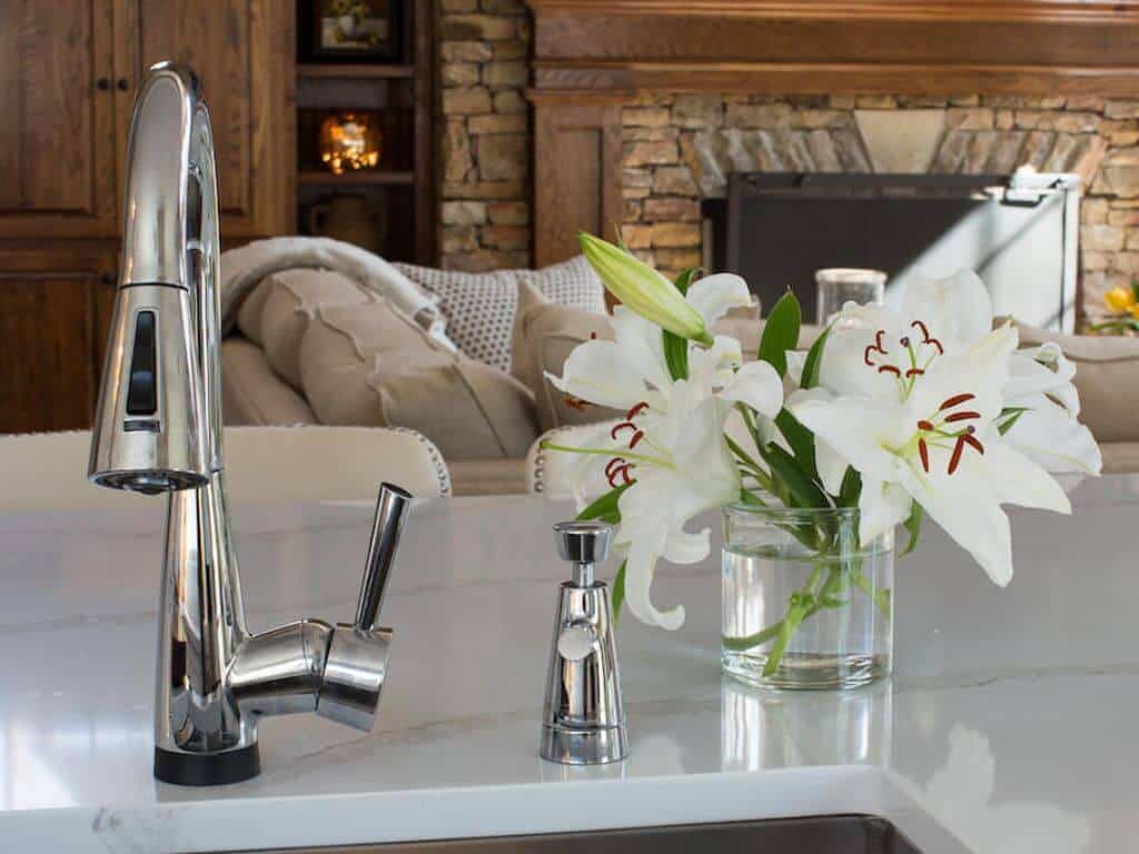
Ahhhh. The countertops alone brightened this space. Add some additional white accents, and boom, Pinterest-worthy.
The ceiling-high cabinets, Pure White SW paint color, brighter counter stools, and quartz backsplash all contribute to the highly luminous appearance throughout the kitchen. Incorporate some excellent overhead lighting, and the desired look is achieved.
REMODELED ISLAND SIZE 95" X 60"
Design Decisions
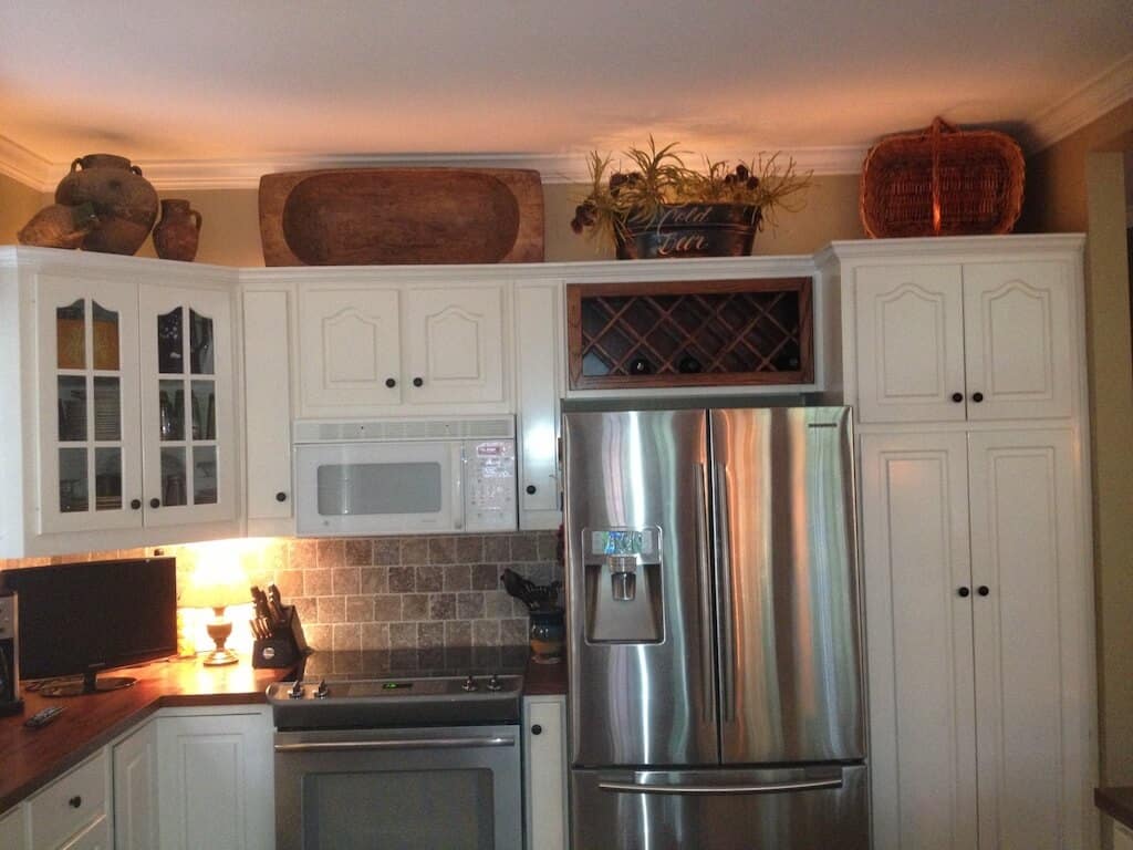
A lot going on in the photo of the kitchen before the remodel. The wine rack, the three appliances crunched together, the cabinet with the glass, and the accessories on top of the cabinets. Bruh.
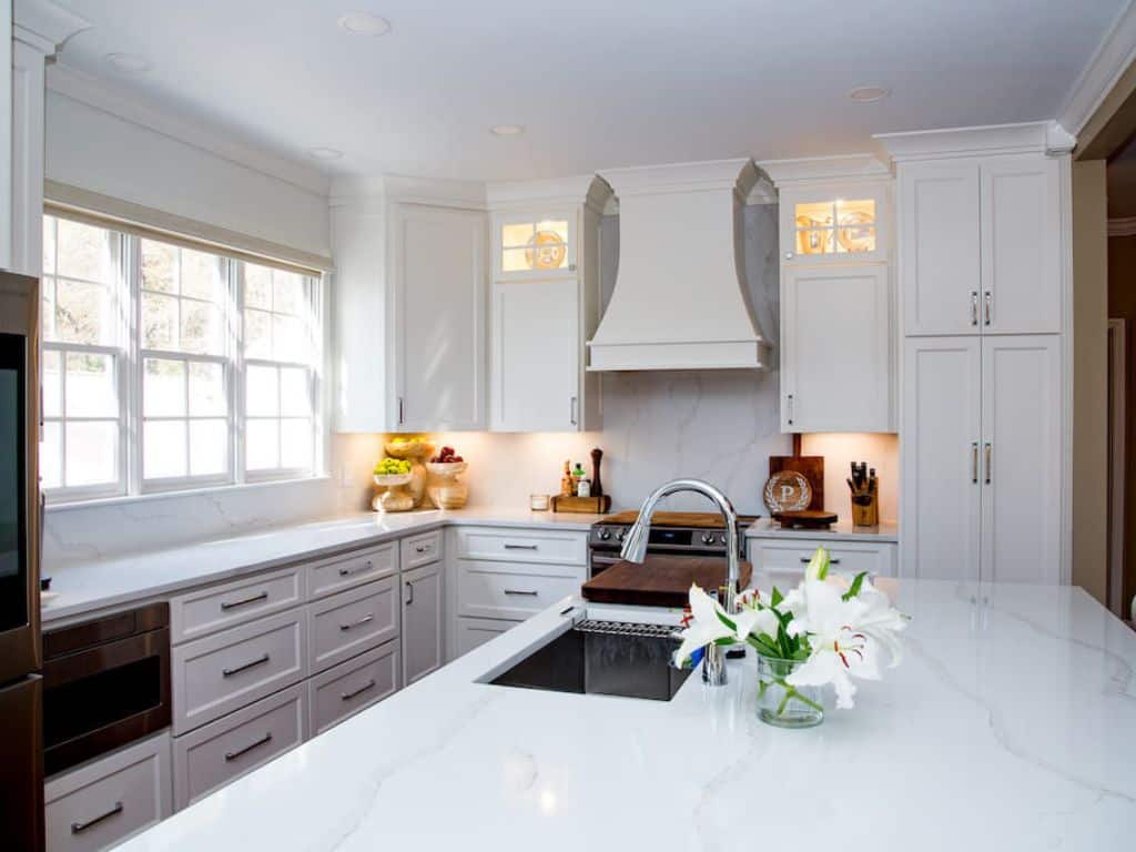
How about we lose the above cabinet decorating? The best way to accomplish this task is to run the kitchen cabinets to the ceiling. There is no break in the space, and the eye will travel without interruption to help the room seem taller & the kitchen larger.
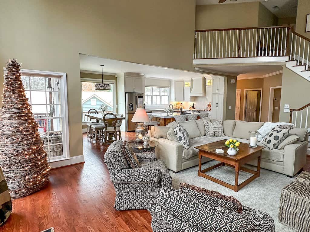
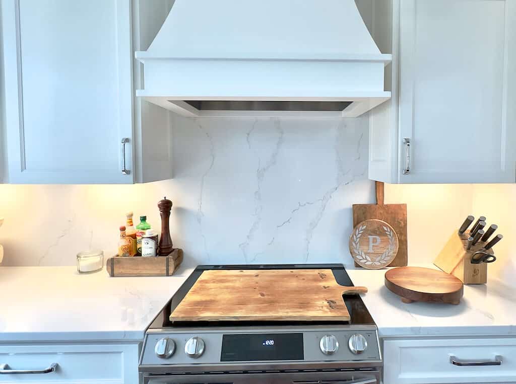
The remodeled kitchen introduces clean lines and simplicity. Enter a gorgeous Vent Hood, symmetrical cabinetry & minimal glass with lights to illuminate accessories.
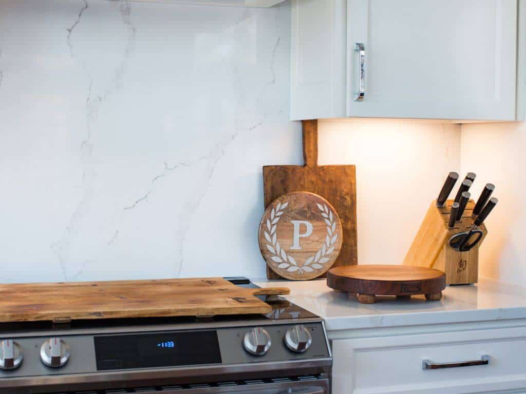
The continuous quartz to the ceiling on either side of the vent hood enhances the backsplash. The white-painted vent hood allows no interruption in the space to give it a constant flow for the eye. Seamless. Bright. Appealing. Simple. Clean.
Dining & Breakfast Area
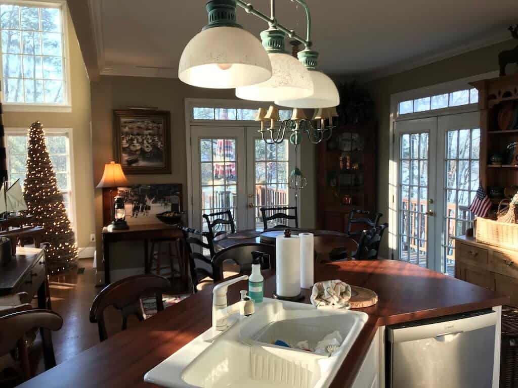
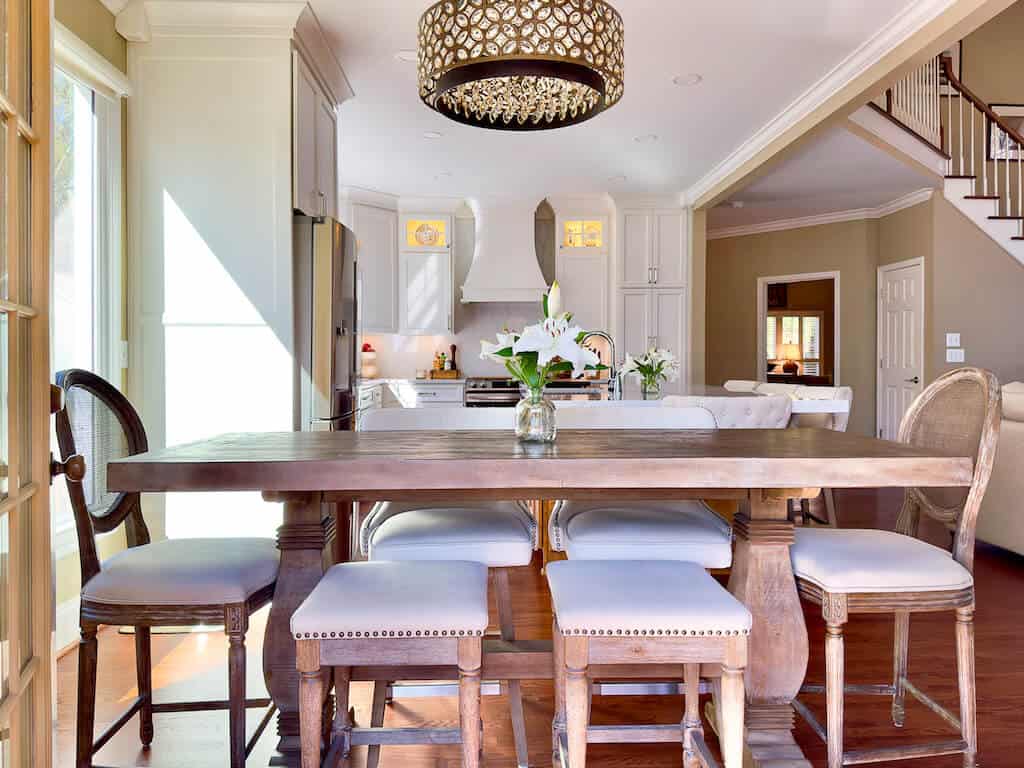
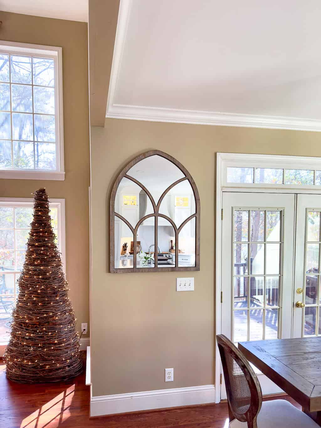
The above photo shows the old dining space. The original design incorporated two sets of French Doors for the view. The new thing to do is lose the transom windows. The Picture Window has always been in the dream. New 9-foot transom-less, all-glass French Doors are still a dream.
The chandeliers were fun in 1998. However, these light fixtures have bothered me for many years. Decorating is personal, and while redesigning the kitchen, I decided on no pendant lights in the kitchen area. Post here about that decision.
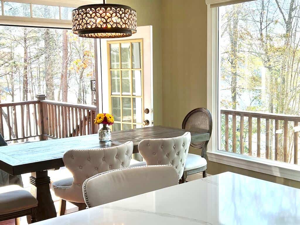
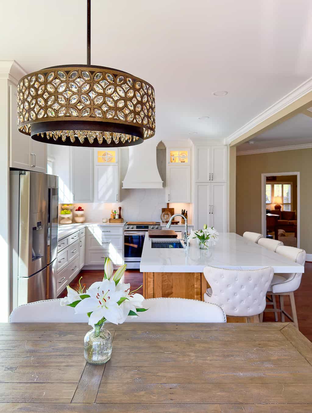
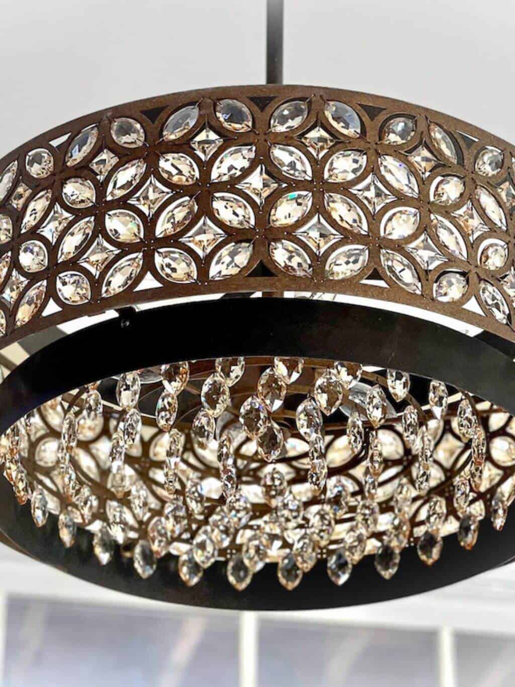
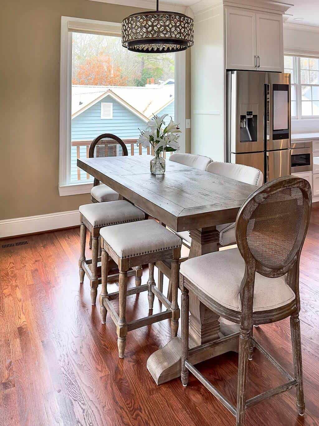
I fell in love with a new dining room light fixture and knew it when I saw it hanging in a showroom. I found it online for half the price, bought it, and there it sat in the box for almost two years, waiting to be hung.
The Dining Space was part of the kitchen remodel. The amount of distress this area caused me is comical, not comical.
The short story about the dining area is I thought I could deal with it later. The big a** island was a priority. It all worked out in the end, but please do not discount every square inch of your main living space. The long story about the dining area is here.
The dining room chandelier "spoke to me." The phrase "it spoke to me" ~ ha ~ a funny story about that phrase here!
The picture window became the centerpiece of the entire kitchen. Expansive lake views shine.
The screened-in porch and new all-glass french doors are in the plan. The long-range plan, ugh.
The Kitchen Before The Remodel
I loved my kitchen from the get-go. The 1998 design was brilliant. For entertaining purposes, the creation of my dream kitchen was a design that incorporated the dining room and great room. I am pretty impressed with my 1998 self about this feature.
Check out my 1998 Inspiration Book for all the images that helped make this decision.
The original home plan design is still relevant. It leans rustic to incorporate the lake from every angle. Not having to change the footprint of our perfectly sized lake house has been a miracle.
A kitchen remodel begins with the cabinetry. There are many options to consider throughout the process.
One of our options included keeping the current cabinets and adding a fresh coat of paint. Significantly more cost-effective. My husband tried to present this as an option, NO! I will not share all the reasons, just NO!
Because the decisions about your cabinets are paramount, I created an entire post about choosing your Cabinet Contractor.
There is a tremendous amount of information about the kitchen remodel in the above post link.
The Vision
The view of the lake became the starting point for all of the room remodels, especially the kitchen.
As you can see from the images above, unfortunately, we had to cut down the Lelands that had provided a barrier to hide the house next door.
We planted new Green Giant evergreen trees in 2020, and they have begun to grow, just not there yet. We spaced to maximize the lake view while providing privacy, hopefully soon.
The Picture Window has created massive brightness and provides a gorgeous view of the lake.
The kitchen countertops and cabinets also lend to enhancing the brightness. The base of the island is stained and the contrast keeps the kitchen balanced. Adding wood elements help tie all of the rooms together.
The vision has always been to keep the lake front and center. The lake is the focal point of the entire home. Enlarging the views provides a daily shimmer when the sun is shining.
Knowing what you want and making it happen in the desired space can be challenging. Enter many Contractors, many ideas, and many, many dollars.
The ability to create the Dream Kitchen does not happen overnight. Decisions need to be tactical, so more research done ahead of time is critical.
Every square inch needs to be considered and planned.
We needed to consider the entire living space while remodeling.
I needed to upgrade some of the furniture. Yay, me! How can that possibly be with two fully furnished homes?
Regarding the cosmetic upgrades when remodeling, you will want new stuff.
Yes, it's a thing. Prepare and budget.
The Footprint
I was desperate for a TV over 20". We hung the 75" TV on the fireplace, which helped with some design intentions.
Not having pendant lights above the island provides a clear view for the TV and saved money. See the full post here about this decision.
The dining room chandelier would provide the dimension needed for the space. The chandelier offers brilliant light and sparkles while incorporating a rustic feel.
The footprint of the home is fantastic. The open floor plan allows for everyone to be together at all times.
The complete rework of the kitchen has been life-changing. Backing into the kitchen design worked beautifully.
Using the non-negotiables as the starting point and infusing the ideas I have had for years paid off. Choosing the flush overhead lighting helped create a minimalist aesthetic and cleaned up the kitchen space.
With the assistance of a great cabinet craftsman & his team, my dream became a reality.

