Inspiration Book 1998 ~ A Guide to the Home Build.
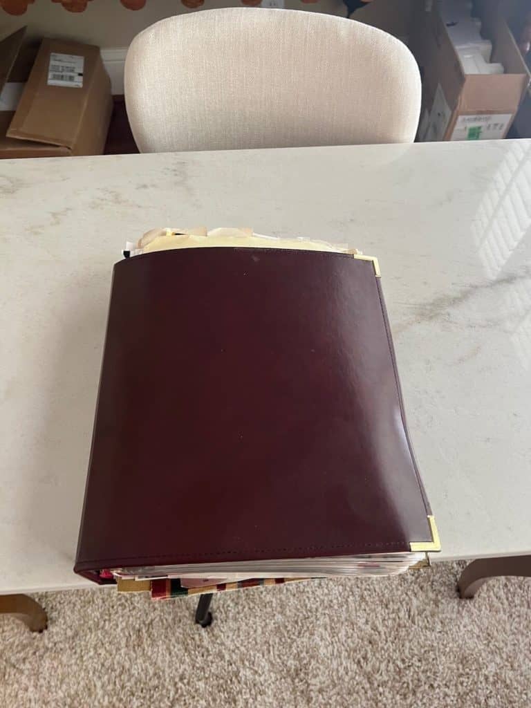
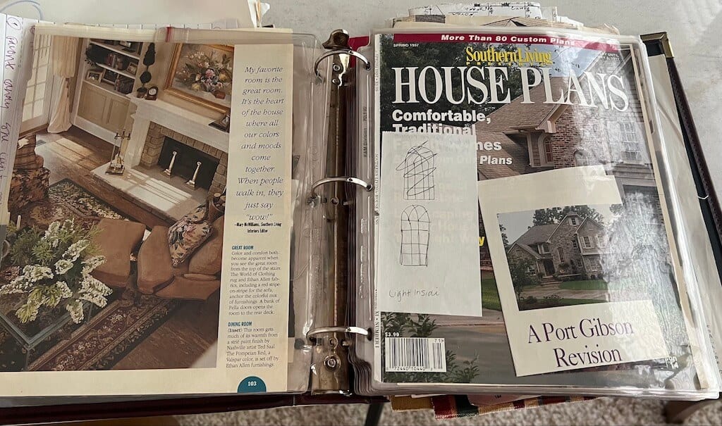
In 1998, the internet was not a thing so my Pinterest was magazines and print media. The image below is the 1998 Home Design Inspiration Book I used to build my house and it is as dated as the content. However, if you look at the images of the before photos of the house, idea pictures remain the best way to create your dream home.
Nice Leather Bound notebook with gold tab corners, very impressive.
Home Design Inspiration Book ~ 1998, cute huh?
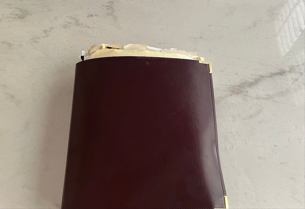
Inspiration Pages
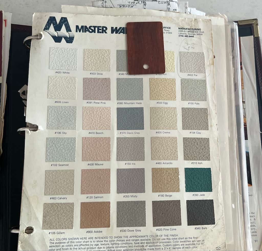
The Hard Coat Stucco color palette is shown below because I could not afford brick and did not want to deal with the maintenance of wood siding. The hard coat stucco has been great because the maintenance involves a pressure washer, and it cleans quickly.
I chose the color PAR, and I always remember the name of the color.
The sample at the top is the color of the Formica countertops. Windsor Mahogany is the name and I love this because it looks like wood. Even though it is Formica, no one could tell, and everyone seemed to love it. My mom has this in her lake house, and I copied it from her.
Most pages from the book are from the Southern Living Idea Houses. I have always loved these homes.
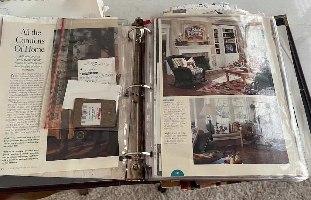
Southern Living Home Design Inspiration
As much as I would have loved to use one of the Southern Living house plans, I could not afford to build one of their homes, and my lot was way too small for those footprints. Great ideas came from those Southern Living Street of Dream Homes.
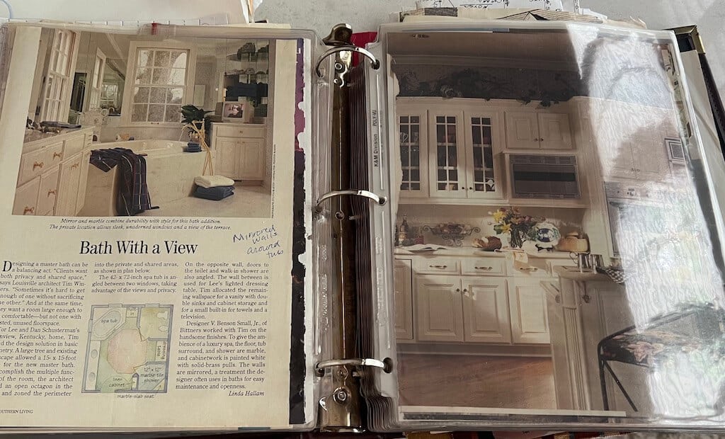
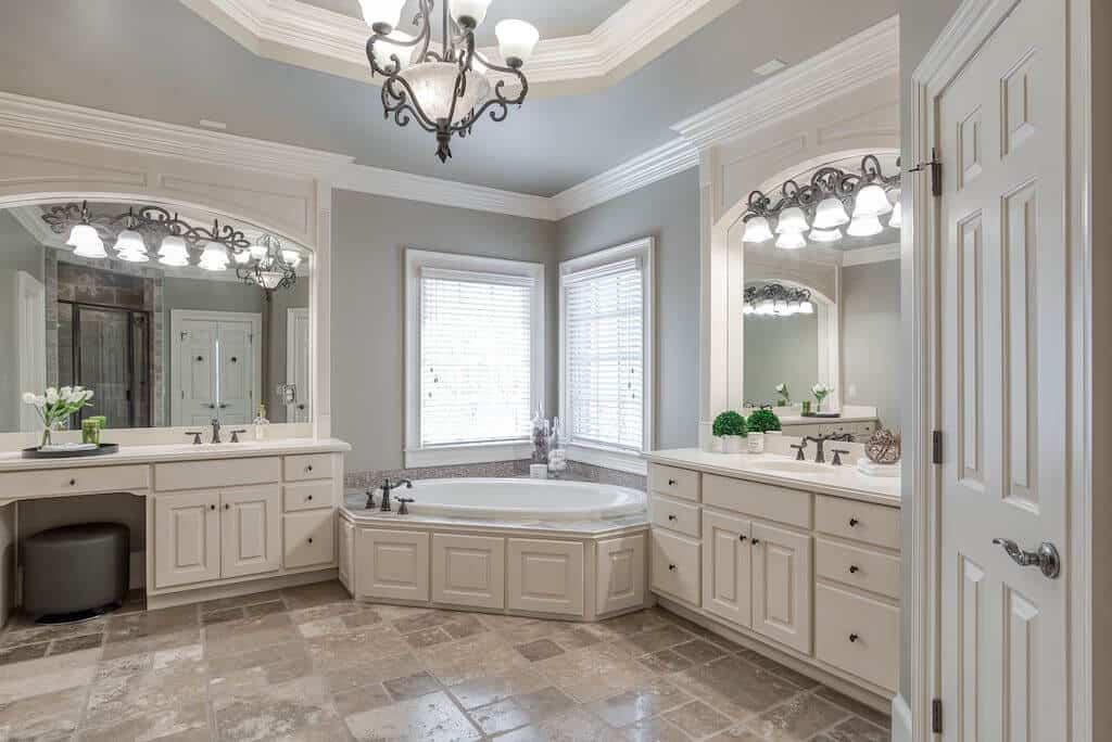
There is a little bit of irony here. While I did not install a tub in the master bath when building the lake house, I loved the layout of the master bathtub below the windows, shown below left. When we moved to the Johns Creek house, this exact look was in the master bathroom! Bizarre. Loved it so much.
I think the last bath I took was when I was six years old, so the tub thing was simply for looks, hence the reason there has never been one installed in the master bathroom at the lake house.
Planning & Accessorizing Home Design
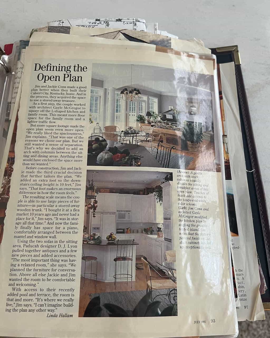
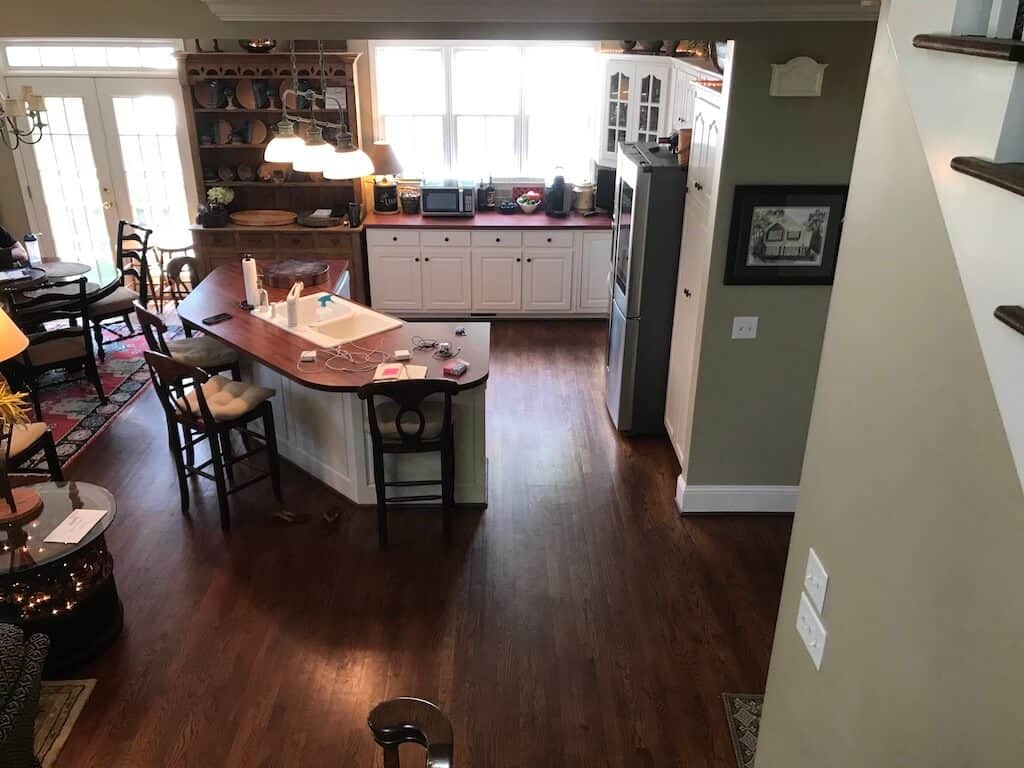
The most important design feature for me in 1998 was an open floor plan. The kitchen, dining, and Great Room flow together with high ceilings. The builder did something amazing with the house plan. He put in a large header beam to replace a post on the island that would have been very in the way and very annoying.
The current remodel would have been extremely difficult. Irritating posts would have changed the entire look and feel of the home. It would have broken up the flow, and editing this during the remodel would have been expensive.
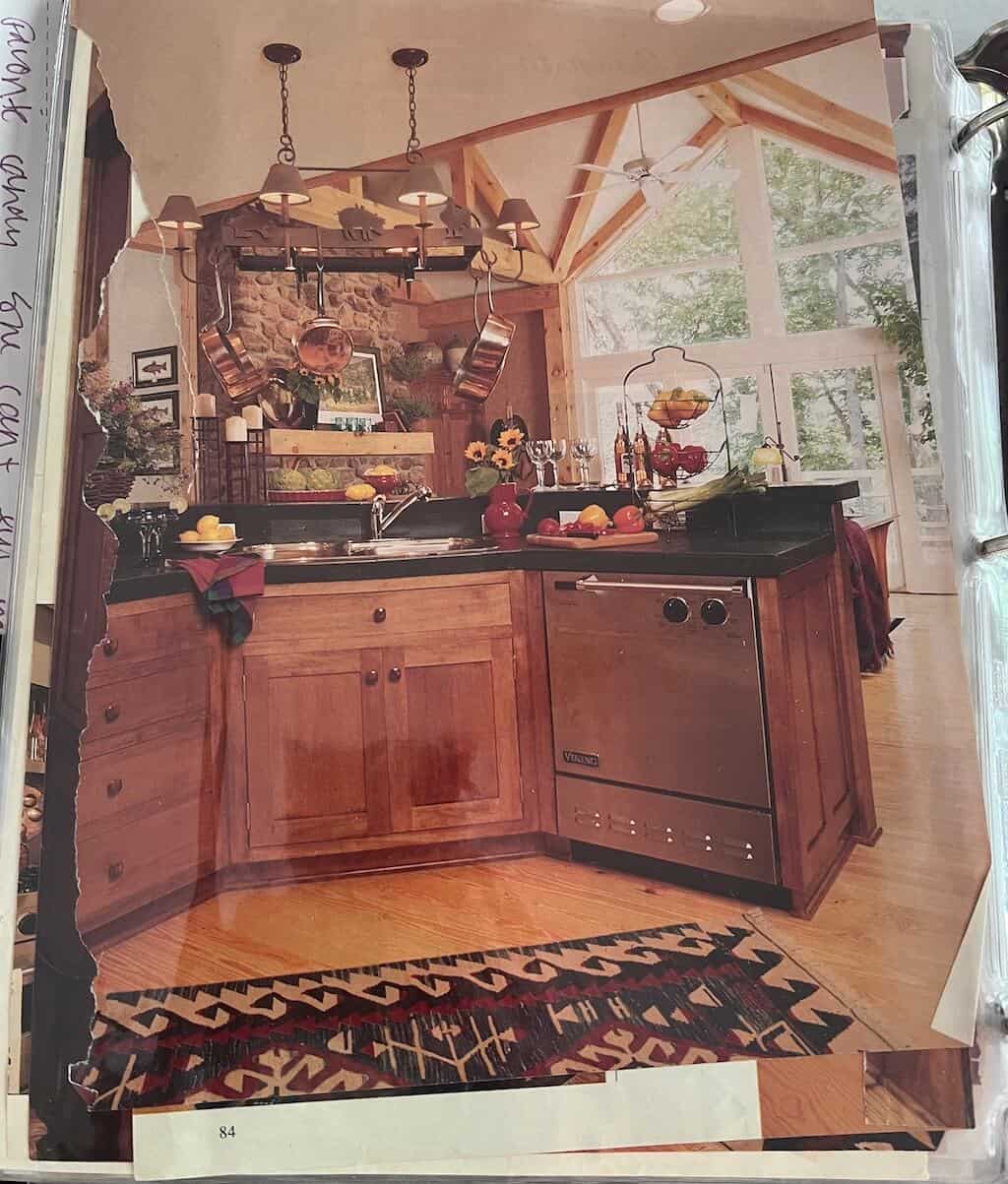
I got the idea for the angled shape of the kitchen island from magazines. At the time I went back and forth about having a two-tiered kitchen island. My mom gave me a disgusted look when I mentioned the two-tiered island. Enough said or seen.
The only reason for the two tiers was to hide the sink. I have always been grateful to have a single surface island. Nowadays, the first thing people do when they remodel their kitchen is scrap the double tier.
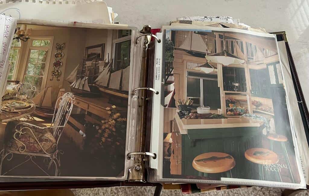
Below, I love all the sailboats. Growing up, I was exposed to a lot of sailing. My dad and brother are great sailors, and from a very young age, I was drawn to the beauty of sailboats, so I wanted to incorporate them in the lake house.
Sailboats are a simple accessory idea that made sense in a lake home. I always had these images in the inspo book. Growing up, we did a lot of sunfish sailing in Litchfield, CT.
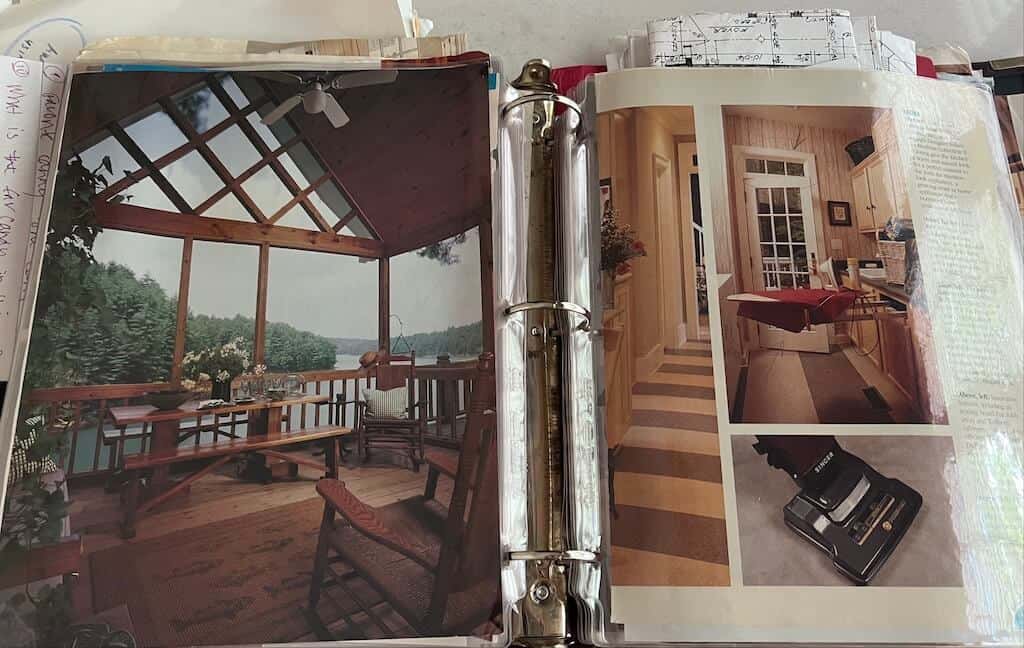
I am still dreaming about the screened porch below. 2024? 2025? 2035? 2045? 2095?…I’ll be dead.
The image of the lake house shown below on the right is one of my favorites. I wish we could have a permanent dock, but not on Lake Lanier. I guess the people of Atlanta need water.😉
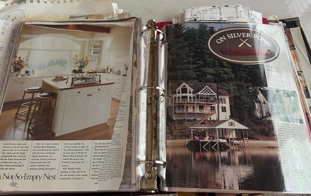
The 1998 Home Plan Inspiration Book
For the record, when searching for a home plan for the build, I had an architectural firm design a house for me. It is a long story, but the septic tank was already installed on the property, and the initial design of the home was not going to fit on the lot based on the location of the septic tank. It all worked out in the end because I found a house plan in the book below, Narrow Lot House Plans. My dad pointed to the house on the cover and said, build that one, and I did.
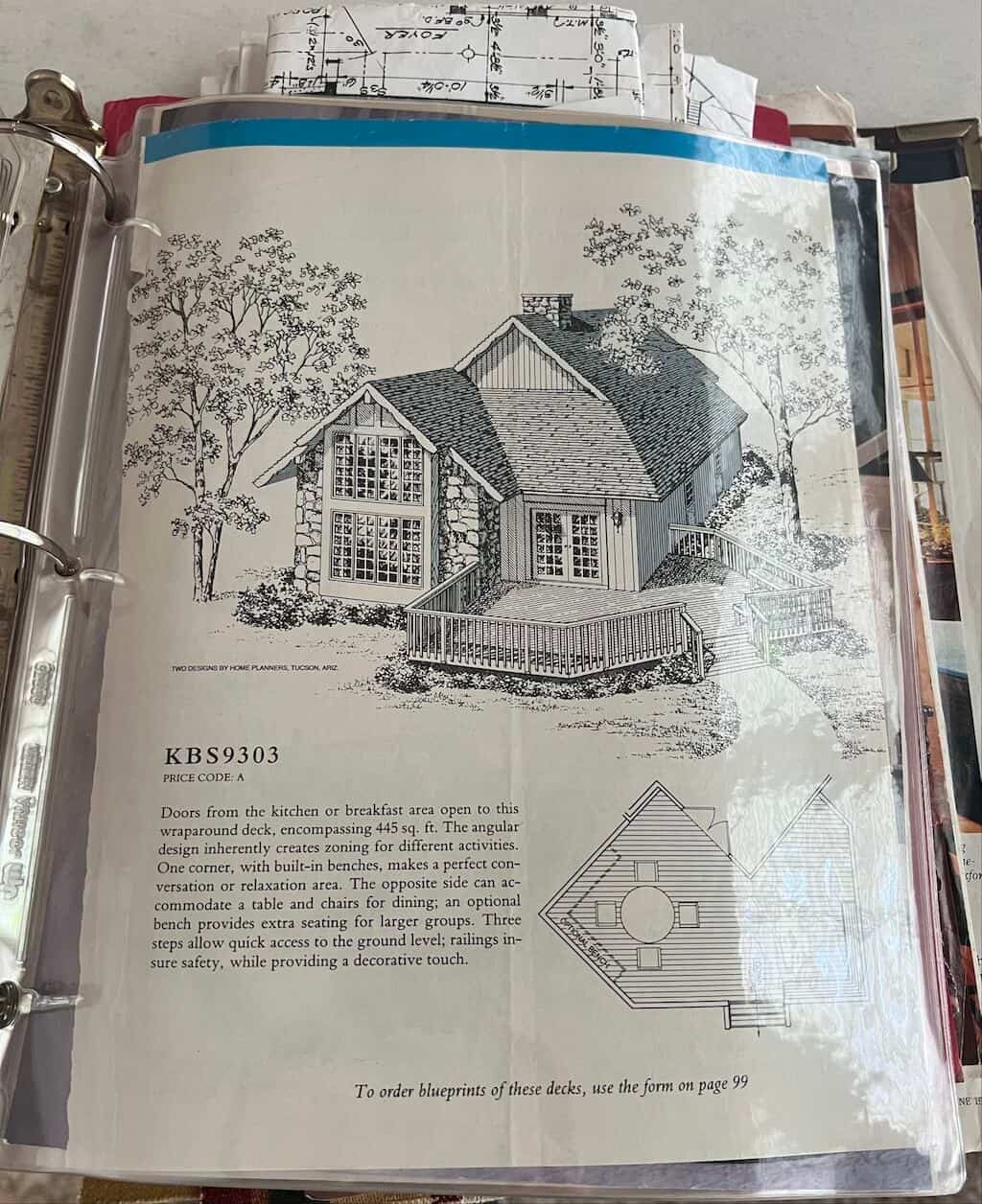
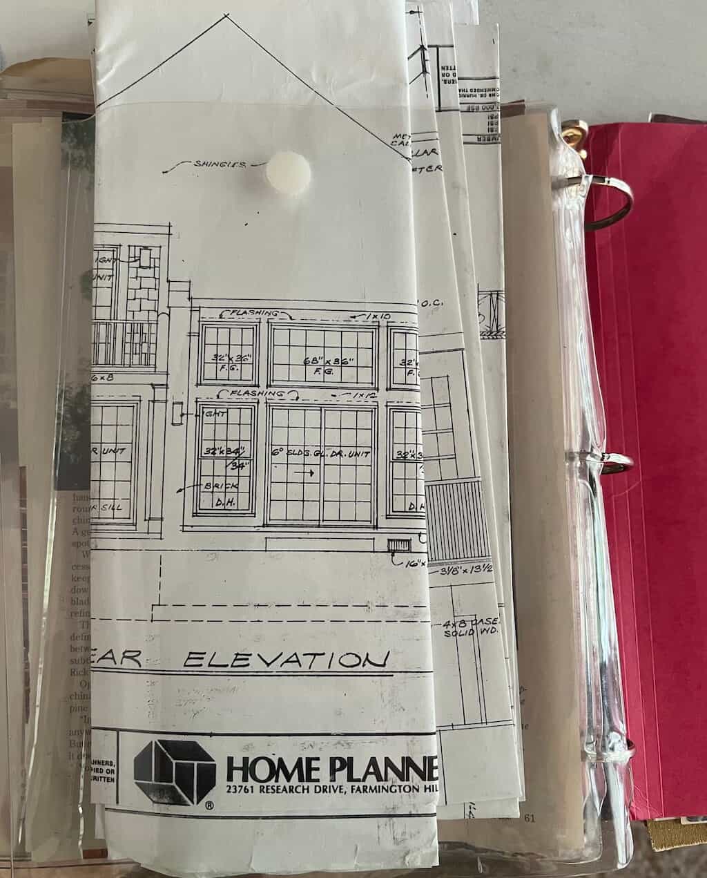
The moral of the story is technology has come a long way, but the methods have remained the same when building and designing homes. There is nothing like a picture when formulating your ideas. Use images to share with those constructing your dream home so all those dreams come true.
